Quick answer
Responsive design means one website that adapts to every screen instead of a separate mobile site. More than 60% of web traffic now comes from phones, and Google ranks mobile-friendly pages higher, so a single responsive site serves both visitors and search rankings.
Responsive Web Design in Boulder — One Site, Every Screen
More than 60% of web traffic now comes from phones and tablets, and Google uses mobile-first indexing — meaning the mobile version of your site is the one that determines your ranking. If your site frustrates mobile visitors, you’re losing both customers and search positions.
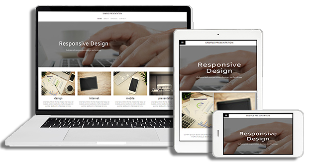
Why does your business need a mobile-friendly website?
- Mobile devices account for the majority of Google searches — including ‘near me’ searches by local customers
- 80% of visitors abandon a mobile site after a bad experience
- Google ranks mobile-friendly sites higher in local results
When someone in Boulder searches for your service from their phone, your site has seconds to load fast, read clearly, and make the phone number tappable. That’s what responsive design does.
What makes a website responsive?
We don’t bolt mobile support onto a desktop site. Every website we build for Boulder, Louisville, Longmont, and Denver-area clients is designed mobile-first: fluid layouts, optimized images, and fast load times on any connection. One website, perfectly usable on iPhones, Android phones, tablets, and desktops.
Already have a site that struggles on phones? We can retrofit responsive design or rebuild it right. Ask us how — 720-588-0760, or request a free estimate.
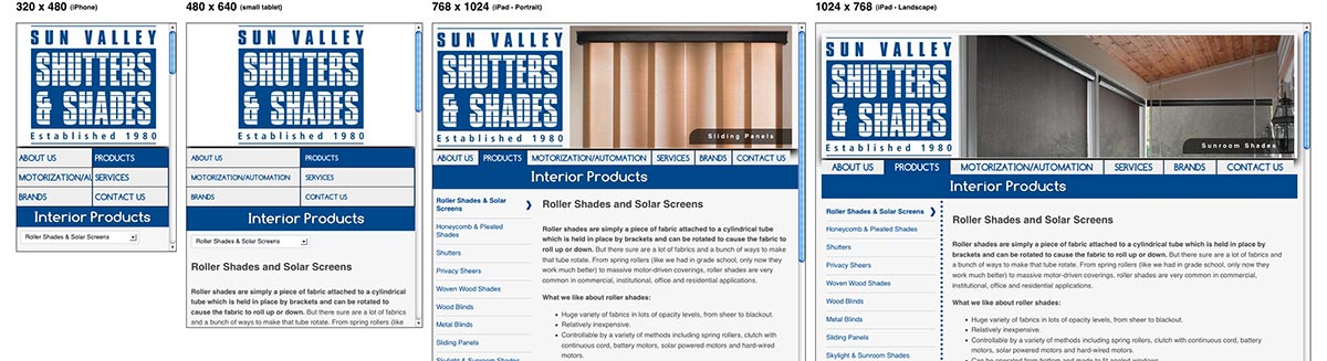
See how one website can be optimized across different screen sizes